The arm and forearm of the model on the ground looks a little off. My first thought was that it looked way too thin, but considering the angle the arm is seen at, and that the thickness of the blood was covering a portion of the arms, it may not entirely be an anatomical issue. It would probably also help if you positioned his arms and hands/fingers a bit more naturally on the floor, I guess.
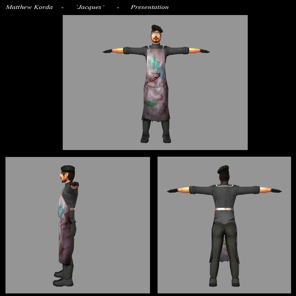
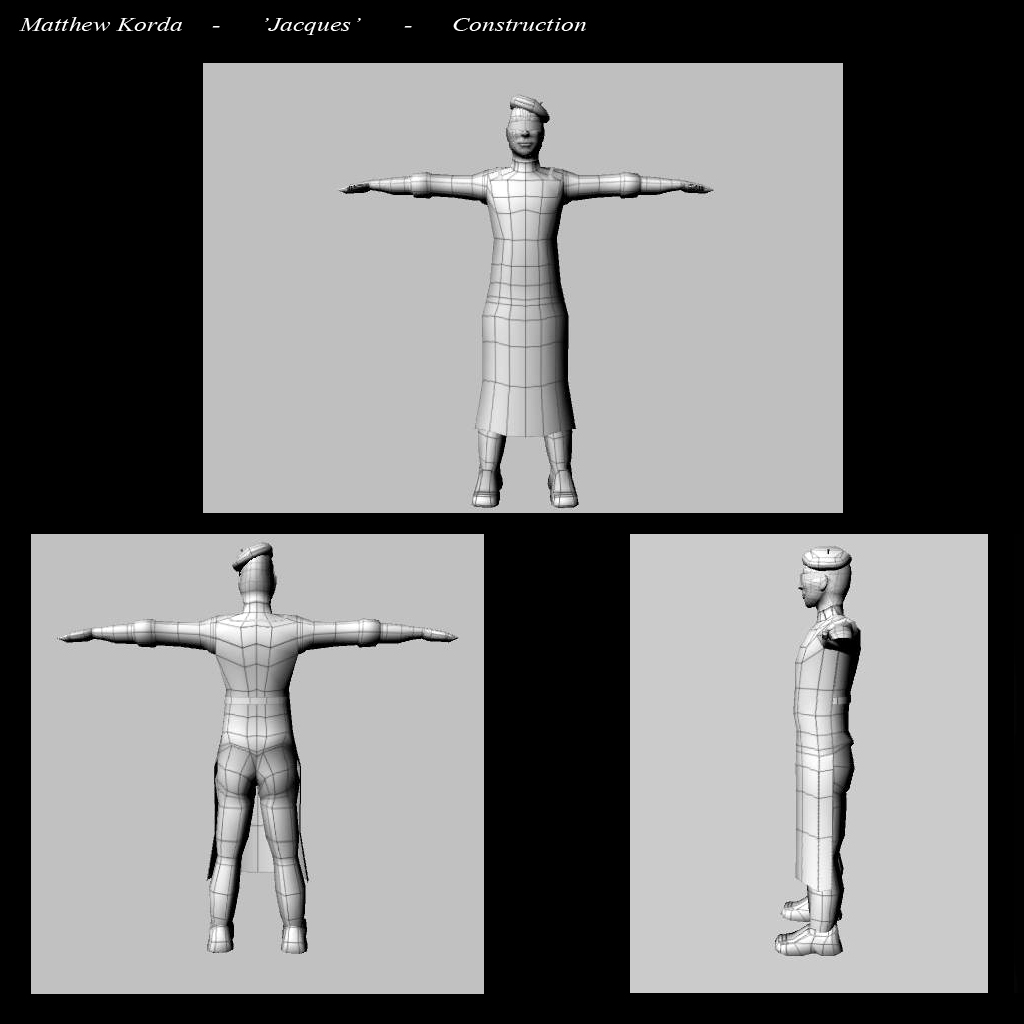
I'm guessing the focus really is the model standing up, since you provided the wireframe and texture shots of it, and hey, it looks good.
your absolutely right with the dead body he was posed before i had a rig and was manipulated with transpose in zbrush during the process the proportions got skewed and since the due date for the project has just passed it wasn't something i fixed.
Just a bit of advice, no one on here cares wether the due date for this has passed, they only care about how good it looks, considering this is what you are posting to represent yoruself.
Its a cool idea and done reasonably well - but there are one or two things that could be easily fixed up. The pose of the dead guy needs some effort invested, and the lighting/rendering could be better. Also, you would go far to give the base and blood effects some attention. And as has been said before, the arm of the dead guy looks very off.
Overall though its not bad, and its well on it way to being a folio piece. But some employers on here will look at its flaws and wonder why you didn't address them. If you can see something needs improvement, you should work on it, regardless on wether or not your courses deadline has passed. If you don;t. people are goign to assume that you yourself don't 'see' the mistakes, and that can hold you back when your folio is being compared. And trust me, its all about the folio.
fair advice mr anonymous I haven't learnt any rendering techniques in maya yet and what i have is from trial and error but I will try to post an update soon to fix some of the problems that have been mentioned here
AIE should be ashamed, who sets the quality benchmark over there?
Basically, the piece looks ridiculous.
To make it awesome and not ridiculous please, please, please do the following:
Dead guy
1. Spend some time and make a proper civilian mesh (a serial killer wouldn’t murder a balaclava clad mercenary)
2. Make the dead body a woman? (more appropriate)
3. Pose the dead body in an artistic and extravagant way; like he\she has been murdered and posed (he's an artiste, right? Keep with your theme) Arms outstretched, mimicking a character in a famous painting (or something)
4. The paint brushes are just stuck in the body really lame. Stick the paint brushes in where they would cause death. Stick one in his 'heart', one in his eye, maybe 1 for each hand and foot so the body is 'crucified'? Make it really fucking dark, he's a serial killer for god’s sake.
5. The blood pool looks awful. Do something with it, maybe the killer has 'painted' with the blood and tried to create a work of art. Mix some blood brush strokes with the dead body pose (as discussed above) make it striking and dynamic, he's an artiste, right? Reinforce your theme.
6. Fix that small arm, why would you present something to an audience that you know is wrong?
Background
Red background looks awful, if you have limited time just use an entirely black background and a couple of light sources to light the scene. Use dramatic lighting and spend a bit of time with light placement to get some cool shadows. Experiment a bit, and come up with a simple but effect background with some simple lighting. Watch some classic horror movies to see how they achieve dramatic lighting for reference.
Jacques
1. He looks awful just standing there; he looks half asleep and expressionless like he doesn't give a shit. Solution? Pose him properly. Maybe he's examining the body from a specific angle, holding his hands and fingers together to 'frame' his work (victim) and choosing a good angle. Do you know what I mean?
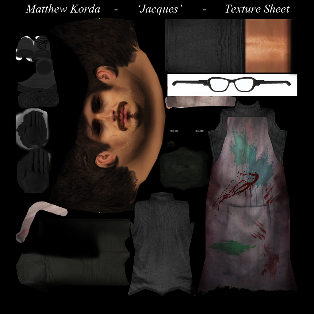
2. The long smock is a good start, go nuts with blood and different paint colours on it.
3. Add some finger drag marks to the smock, like dieing victims have clutched it in their death throes
4. Do something with his clothes, they're dull. Research some famous early century artist's on Google and see what they wear. Find some cool stuff, and dress the character up with your own modern interpretation
5. The fogged up glasses and facial expression look bad; can we see his eyes through the glasses? He needs an expression dude, give him some life. A big evil smile or grin? Maybe he’s elated and wide eyed with glee after killing his latest victim. Give the guy some character; he's too lifeless and generic. Looks like Gordon Freeman in a beret (*yawn*) Make him more unique looking.
Floor plate.
The floor plate with the stone tile texture looks crap, just do a simple concrete floor that fades to black (refer to lighting as above)
If you want to get somewhere in this tough, tough industry you need to push yourself. Spend some time implementing the feedback, repost, and sit back and watch the positive reactions roll in, ok?
I look forward to seeing your talent develop and in seeing how far you can push your creativity.
Please don't be discouragd by anything Marty says. While he might have some legitimate sugestions, and your work coudl have some improvements, it is NOT rediculous, and no one should be ashamed by it. You would do well to take some of the feedback here on board, but should not be discouraged at all by it, regardless of the language used. Good artists will always seek to improve, and you have been given a lot of help in that regard on here already.
To put it lightly, Marty has a well known industry wide reputation for being brazen. And for anyone out there who may come into contact with him, all I would suggest is to do a little bit of research on the internet before continuing any sort of contact.
Thanks for the replies,
I cried a little when I read that post and contemplated suicide... Nah you always get some asses and egos when dealing with artists but like you said he did have some constructive points which I will try to take on. I have updated the character and fixed some of the issues with lighting and the base (and once I can figure out how to update a post Ill add it here) I probably won't spend too much more time on this however as Im eager to start some new projects
I just re-read all the posts on here and want to take back my asses coment. Its hard sometimes to distinguish tone in blogs like this and I think marty actually sounds a lot cooler than my first impressions led me to believe
All things considered this is not at all bad. My first attempts at character modelling were actually much worse.
It would be good if we could be constructive in our criticism and also bear in mind the experience level of those on the receiving end.
Good on you for showing us your work, it takes a lot of nerve to do this. Don't let a bit of negative feedback put you off. If you persevere you will almost definitely improve in leaps and bounds.

oh the base is a quick normal
oh the base is a quick normal mapped object from zbrush and the dead guy is just an altered an re-textured version of Jacques
Anatomy
The arm and forearm of the model on the ground looks a little off. My first thought was that it looked way too thin, but considering the angle the arm is seen at, and that the thickness of the blood was covering a portion of the arms, it may not entirely be an anatomical issue. It would probably also help if you positioned his arms and hands/fingers a bit more naturally on the floor, I guess.
I'm guessing the focus really is the model standing up, since you provided the wireframe and texture shots of it, and hey, it looks good.
your absolutely right with
your absolutely right with the dead body he was posed before i had a rig and was manipulated with transpose in zbrush during the process the proportions got skewed and since the due date for the project has just passed it wasn't something i fixed.
Some feedback
Just a bit of advice, no one on here cares wether the due date for this has passed, they only care about how good it looks, considering this is what you are posting to represent yoruself.
Its a cool idea and done reasonably well - but there are one or two things that could be easily fixed up. The pose of the dead guy needs some effort invested, and the lighting/rendering could be better. Also, you would go far to give the base and blood effects some attention. And as has been said before, the arm of the dead guy looks very off.
Overall though its not bad, and its well on it way to being a folio piece. But some employers on here will look at its flaws and wonder why you didn't address them. If you can see something needs improvement, you should work on it, regardless on wether or not your courses deadline has passed. If you don;t. people are goign to assume that you yourself don't 'see' the mistakes, and that can hold you back when your folio is being compared. And trust me, its all about the folio.
fair advice mr anonymous I
fair advice mr anonymous I haven't learnt any rendering techniques in maya yet and what i have is from trial and error but I will try to post an update soon to fix some of the problems that have been mentioned here
cheers
Matt
im not willing to leave any
im not willing to leave any comments as this image could have some sort of deeper meaning.
cool concept :)
AIE benchmark is too low
AIE should be ashamed, who sets the quality benchmark over there?
Basically, the piece looks ridiculous.
To make it awesome and not ridiculous please, please, please do the following:
Dead guy
1. Spend some time and make a proper civilian mesh (a serial killer wouldn’t murder a balaclava clad mercenary)
2. Make the dead body a woman? (more appropriate)
3. Pose the dead body in an artistic and extravagant way; like he\she has been murdered and posed (he's an artiste, right? Keep with your theme) Arms outstretched, mimicking a character in a famous painting (or something)
4. The paint brushes are just stuck in the body really lame. Stick the paint brushes in where they would cause death. Stick one in his 'heart', one in his eye, maybe 1 for each hand and foot so the body is 'crucified'? Make it really fucking dark, he's a serial killer for god’s sake.
5. The blood pool looks awful. Do something with it, maybe the killer has 'painted' with the blood and tried to create a work of art. Mix some blood brush strokes with the dead body pose (as discussed above) make it striking and dynamic, he's an artiste, right? Reinforce your theme.
6. Fix that small arm, why would you present something to an audience that you know is wrong?
Background
Red background looks awful, if you have limited time just use an entirely black background and a couple of light sources to light the scene. Use dramatic lighting and spend a bit of time with light placement to get some cool shadows. Experiment a bit, and come up with a simple but effect background with some simple lighting. Watch some classic horror movies to see how they achieve dramatic lighting for reference.
Jacques
1. He looks awful just standing there; he looks half asleep and expressionless like he doesn't give a shit. Solution? Pose him properly. Maybe he's examining the body from a specific angle, holding his hands and fingers together to 'frame' his work (victim) and choosing a good angle. Do you know what I mean?
2. The long smock is a good start, go nuts with blood and different paint colours on it.
3. Add some finger drag marks to the smock, like dieing victims have clutched it in their death throes
4. Do something with his clothes, they're dull. Research some famous early century artist's on Google and see what they wear. Find some cool stuff, and dress the character up with your own modern interpretation
5. The fogged up glasses and facial expression look bad; can we see his eyes through the glasses? He needs an expression dude, give him some life. A big evil smile or grin? Maybe he’s elated and wide eyed with glee after killing his latest victim. Give the guy some character; he's too lifeless and generic. Looks like Gordon Freeman in a beret (*yawn*) Make him more unique looking.
Floor plate.
The floor plate with the stone tile texture looks crap, just do a simple concrete floor that fades to black (refer to lighting as above)
If you want to get somewhere in this tough, tough industry you need to push yourself. Spend some time implementing the feedback, repost, and sit back and watch the positive reactions roll in, ok?
I look forward to seeing your talent develop and in seeing how far you can push your creativity.
Marty
On Marty...
Hey matthew, just on top of this.
Please don't be discouragd by anything Marty says. While he might have some legitimate sugestions, and your work coudl have some improvements, it is NOT rediculous, and no one should be ashamed by it. You would do well to take some of the feedback here on board, but should not be discouraged at all by it, regardless of the language used. Good artists will always seek to improve, and you have been given a lot of help in that regard on here already.
To put it lightly, Marty has a well known industry wide reputation for being brazen. And for anyone out there who may come into contact with him, all I would suggest is to do a little bit of research on the internet before continuing any sort of contact.
Thanks for the replies, I
Thanks for the replies,
I cried a little when I read that post and contemplated suicide... Nah you always get some asses and egos when dealing with artists but like you said he did have some constructive points which I will try to take on. I have updated the character and fixed some of the issues with lighting and the base (and once I can figure out how to update a post Ill add it here) I probably won't spend too much more time on this however as Im eager to start some new projects
I just re-read all the posts
I just re-read all the posts on here and want to take back my asses coment. Its hard sometimes to distinguish tone in blogs like this and I think marty actually sounds a lot cooler than my first impressions led me to believe
All things considered this is
All things considered this is not at all bad. My first attempts at character modelling were actually much worse.
It would be good if we could be constructive in our criticism and also bear in mind the experience level of those on the receiving end.
Good on you for showing us your work, it takes a lot of nerve to do this. Don't let a bit of negative feedback put you off. If you persevere you will almost definitely improve in leaps and bounds.