So, I got a Commodore 64 when I was in the 4th grade. It came bundled with a Rolf Harris picture building program on casette tape which never loaded properly but from what I could tell by its box cover, you could build pictures from a selection of tiles, and each tile consisted of a different pattern. It would've been pretty awesome to play with too - I think you could even describe it as a creative mode Minecraft in 2D. The box cover even had a picture of a castle that was made with the tileset.
I can't recall if Koala Pad came bundled with the C64, but that program was my doorway into pixel art. I drew pictures using a one button joystick on an old blurry TV, and the pictures were limited to a 320 × 200 pixels resolution with a 16 colour palette, and you couldn't use more than two colors within a certain pixel distance or else the colours would switch back which was pretty frustrating. Sadly, I don't have any of the hundreds of pictures I did way back then as you needed special hardware to bring data off those 5-1/4" disks which I didn't have access to.
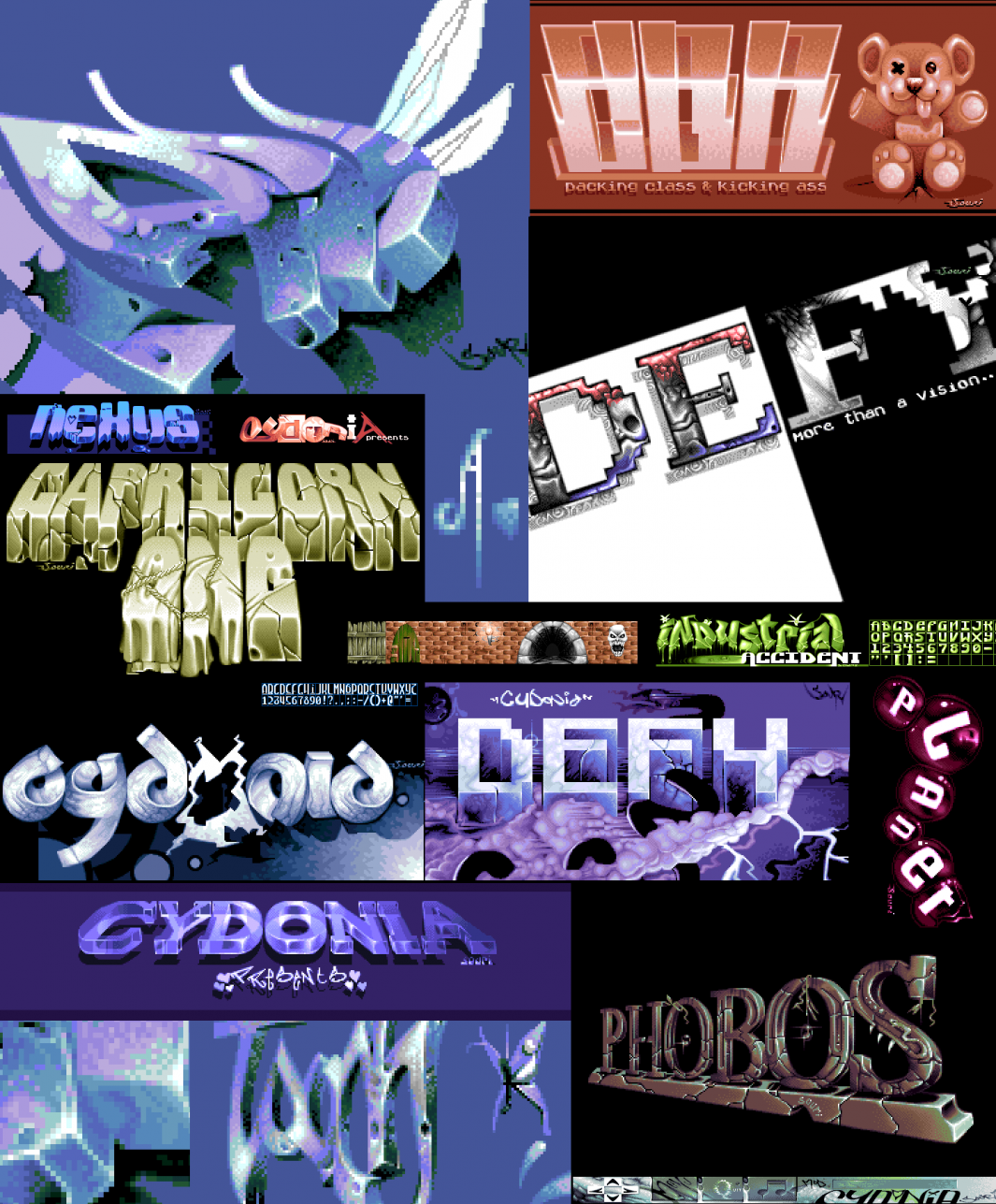
Many years later, I upgraded to an Amiga 500. The Amiga came with a mouse, so that was a definite advantage when it came down to doing pixel art. My A500 came bundled with Fusion Paint which was a fairly reasonable paint program, but the leading paint program at the time was definitely Electronic Art's Deluxe Paint. Even Disney was using it. So with Dpaint III (and then later, Dpaint IV), I continued doing pixel art through out highschool. I joined a few demo groups and worked on a whole lot of the art pieces, title screens and logos, roughly half of which you can see here.
Just a tiny bit about demo's - they were done by groups of programmers, artists, and musicians and were mostly non-interactive technical and graphical experiences which pushed the hardware beyond where games ever went. Demo's required various bits and pieces other than logos and titlescreens including custom fonts, animations, and various kinds of textures and patterns for routines. All the work seen here was done when I was between 15 and 18, the days when Wolfenstein 3D broke out. Unfortunately, the Amiga reached the end of it's days, I went on to study and work in the field of Graphic Design, and that was the end of my pixel art journey.
For the pixel artists out there, if you look closely, you can observe my pixel art going through various experimental changes - the Robert Smith picture (which was printed in Australian Commodore Amiga Review magazine) used some pretty standard and, you can say, pretty sterile dithering patterns. The Karla Gilbert picture (girl sitting on steps) was when I started trying different and more chunky dithering techniques for the background to make things interesting, and the last picture I worked on (the girl eating the apple) was when I hit on a dithering solution which gave the most interesting results - it gives off a really interesting textured result. I used that same dithering in the "class" logo (top left in the logo collage).
I know that had I continued on with pixel art, I would have experimented a whole more with colour, and you could see some of that developing in the "class" logo. I think most artists know that pictures of faces and objects are never a straight gradient shade of a particular colour. Faces, for example, can consist of many, many different colours, with light greys, pinks, oranges, blues etc depending on lighting, shadows, and reflections. Portraits and pictures can have a whole lot more kick and become so much more vibrant and interesting when you mix in various colours. Pointillism, used by painters, is also an idea that carries on perfectly for pixel art for mixing various kinds of colours, especially when you had a limited 32 colour palette on the Amiga.
Finally, I've been a keen observer of the resurgence of pixel art in recent years - there are some absolutely amazing things being done these days with pixel art in games, especially where artists limit themselves to such low resolutions. You can spot the differing styles and fads going on, some borrowed from the early days of pixel art, and others are bringing styles seen more commonly in the illustration field into pixel art form.
From an old-school pixel artist as myself, a lot of the lo-res stuff that's all the rage now would have not been received so well way back in the Amiga days. All jagged edges HAD to be anti-aliased, and you had to dither all your work so you'd never see a colour step into another. You didn't want to show the limitations of your hardware, and antialiasing + dithering everything was a great way to hide all that. Artwork that hid those limitations were much more appealing and looked a whole better in screenshots for games than those that didn't bother. Nowadays, gamers have really come to embrace that really chunky pixel art look and it really has become an extremely appealing style, especially when you bring it to life with some good animation too. I'm planning to jump right back into pixel art in a big way after a 20 year hiatus, after I finish all the stuff I've committed to do for tsumea.
- Log in to post comments


