This is my first post to Tsumea, and while I've been visiting the site for about 2 years now it feels good to finally get involved and show off what I've got.
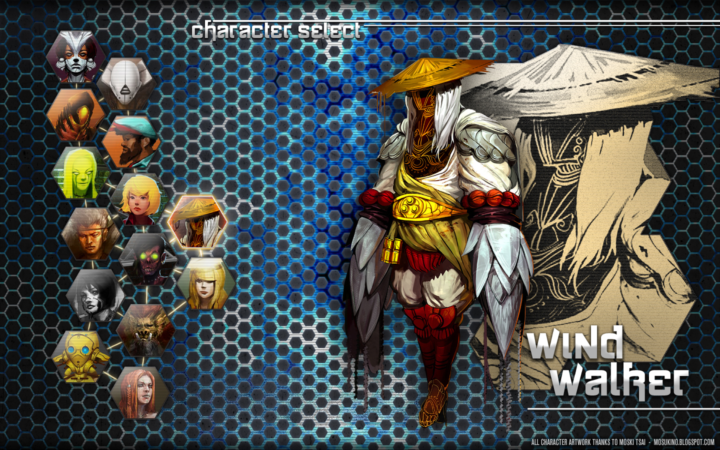
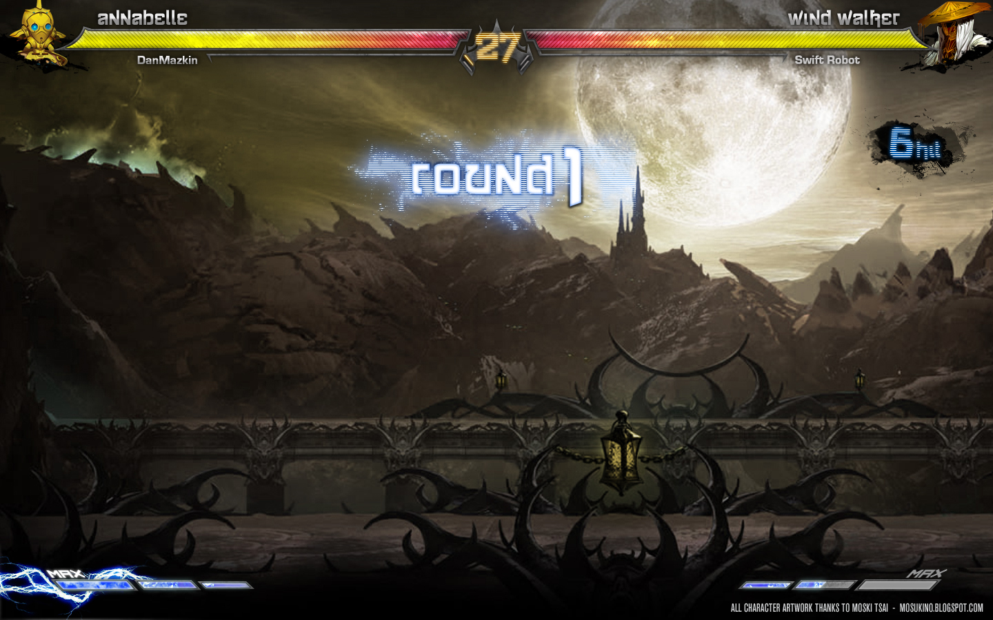
I've been working on a User Interface design concept for a fictional fighting game. This was mainly to explore different options for the possible layout and design of in-game menus and HUD for a fighting game, while also mapping out the timing and flow of some of the menu transitions.
The screens which I've been conceptualizing are:
- Single Player - Character select
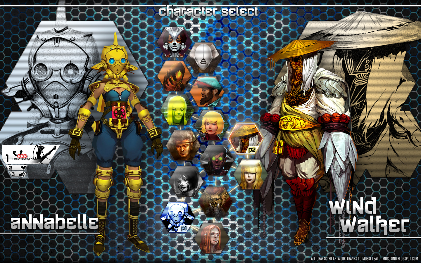
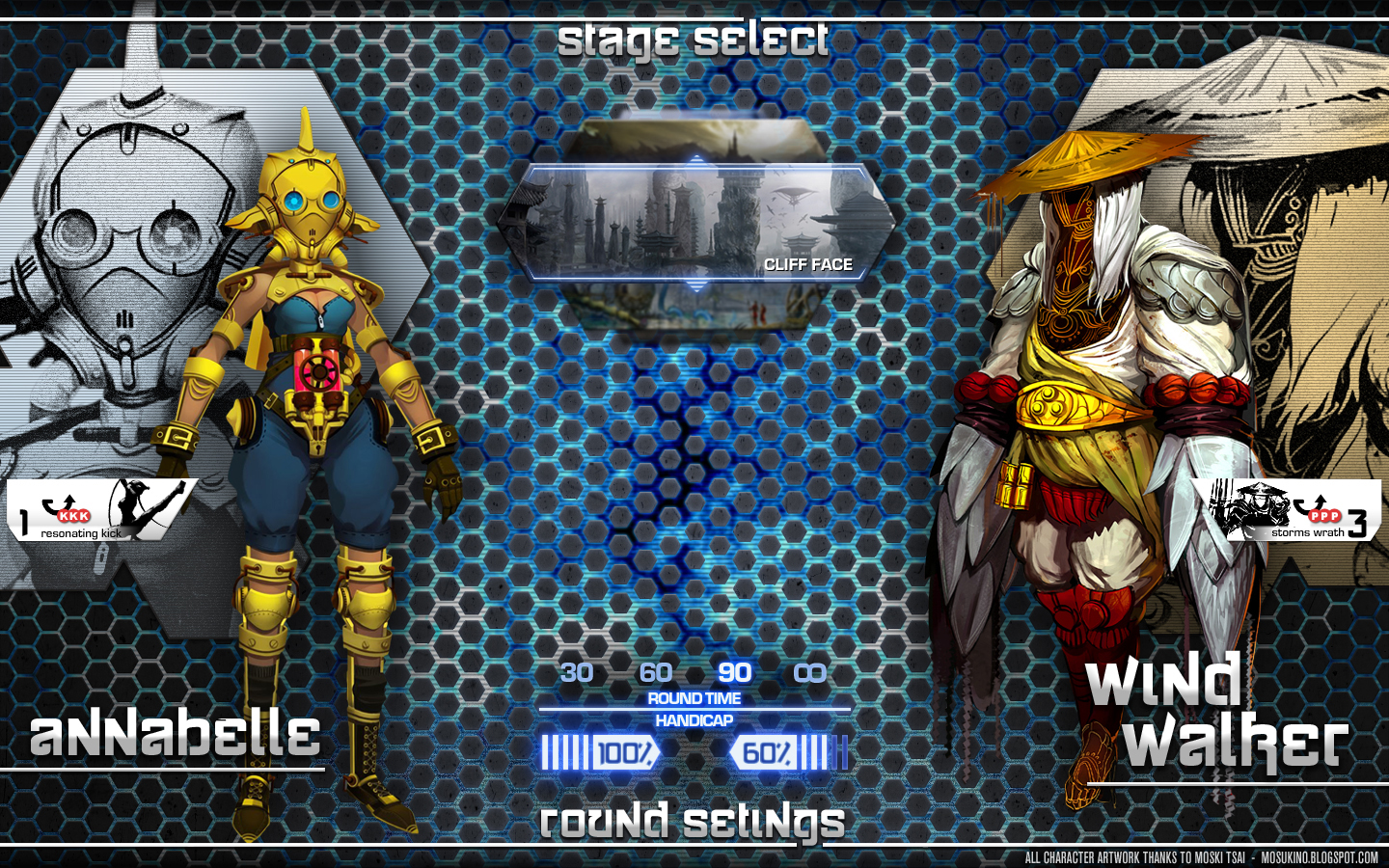
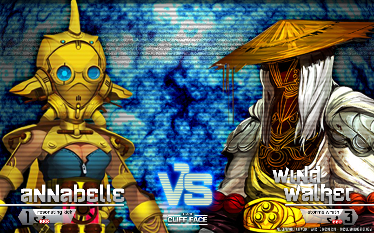
- 2 Player - Character select, stage select/round settings & VS Screen
- In game HUD
All character artwork thanks to the talented and generous Moski Tsai at www.mosukino.blogspot.com, while the background artwork on the HUD concept is thanks to Netherrealm Studios (but don't mention it to them, as they might not know I've borrowed it).
Let me know what you think, any constructive feedback or critique is definitely appreciated.
It definitely looks like a character select screen! I think the black and white character bust shots are great, but I'm wondering if they're used for anything/anywhere besides when you pick a character in the menu.
The bright flashy screen is very characteristic of awesome fighting games, but it still strikes me as rather too bright and not enough contrast. The background is pretty distracting from the actual character/character menu, although that's much more of an issue in the 1P screen than the 2P screen. It's a little hard to read some of the text. Also, is there a reason the icon for the P1 selected character has turned all one colour on the two-player screen, while the P2 character hasn't?
In regards to the text, ytese screen shots obivously aren't at full scale, but I still think I agree with you about the text being hard to read, particularly for the Ultra's. I might make a revision to make these labels a bit larger and clearer.
Also, I should have specified this a bit better, but the 1P Character icon has turned blue because it has been confirmed and has now moved onto the Ultra Select menu. The 2P still hasn't selected their character so their icon is still active and they don't have any Ultra Combo options yet. You can see it in action on the Single Player character select screen here: http://www.lighterfluid.com.au/vault/FightingUIPrototype/
It definitely looks like a
It definitely looks like a character select screen! I think the black and white character bust shots are great, but I'm wondering if they're used for anything/anywhere besides when you pick a character in the menu.
The bright flashy screen is very characteristic of awesome fighting games, but it still strikes me as rather too bright and not enough contrast. The background is pretty distracting from the actual character/character menu, although that's much more of an issue in the 1P screen than the 2P screen. It's a little hard to read some of the text. Also, is there a reason the icon for the P1 selected character has turned all one colour on the two-player screen, while the P2 character hasn't?
Thanks
Thanks for the feedback!
In regards to the text, ytese screen shots obivously aren't at full scale, but I still think I agree with you about the text being hard to read, particularly for the Ultra's. I might make a revision to make these labels a bit larger and clearer.
Also, I should have specified this a bit better, but the 1P Character icon has turned blue because it has been confirmed and has now moved onto the Ultra Select menu. The 2P still hasn't selected their character so their icon is still active and they don't have any Ultra Combo options yet. You can see it in action on the Single Player character select screen here: http://www.lighterfluid.com.au/vault/FightingUIPrototype/
Cheers :)